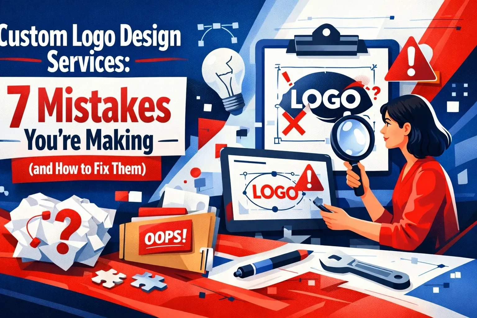
Custom Logo Design Services
7 Mistakes You're Making (and How to Fix Them)
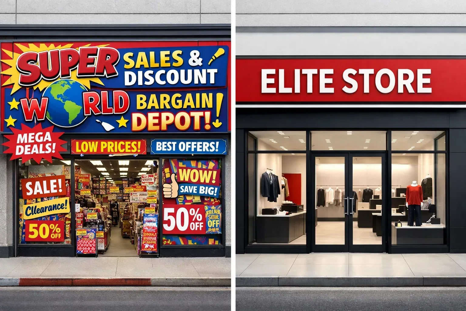
Your logo is doing one of two things: making you impossible to ignore, or making you invisible.
Most businesses fall into the second category without realizing it. They treat logo design like a checkbox: something to knock out on Fiverr for $50 so they can move on to "more important" things. Then they wonder why their brand doesn't command attention, why customers don't remember them, and why they're constantly competing on price instead of value.
Here's the truth: Your logo is the foundation of everything else. It's the first thing people see on your website, your signage, your hats, your business cards, and your social media. If it's forgettable, everything built on top of it will be too.
Let's break down the seven most common logo design mistakes: and how to fix them so your brand actually stands out.
1. You're Overcomplicating It
The mistake: You think "more is more." More colors, more fonts, more shapes, more detail. The result? A cluttered mess that confuses people instead of capturing their attention.
Think about the logos you actually remember. Apple. Nike. McDonald's. They're stupidly simple. That's not an accident.
How to fix it: Strip it down. Your logo should communicate your brand in the simplest way possible. If it takes more than three seconds to understand what you're looking at, you've lost.
Start by asking: What's the one thing I want people to feel or remember about my brand? Build from there. Remove everything that doesn't serve that singular goal.
2. You Didn't Think About Scalability
The mistake: Your logo looks great as a 2000px file on your desktop. But when you shrink it down for a website header or blow it up for a storefront sign, it falls apart. Thin lines disappear. Small details turn into blobs. Gradients look muddy.

How to fix it: Design in vector format from day one. Test your logo at every size: from a tiny social media profile pic to a massive banner. If it doesn't work at both extremes, it doesn't work.
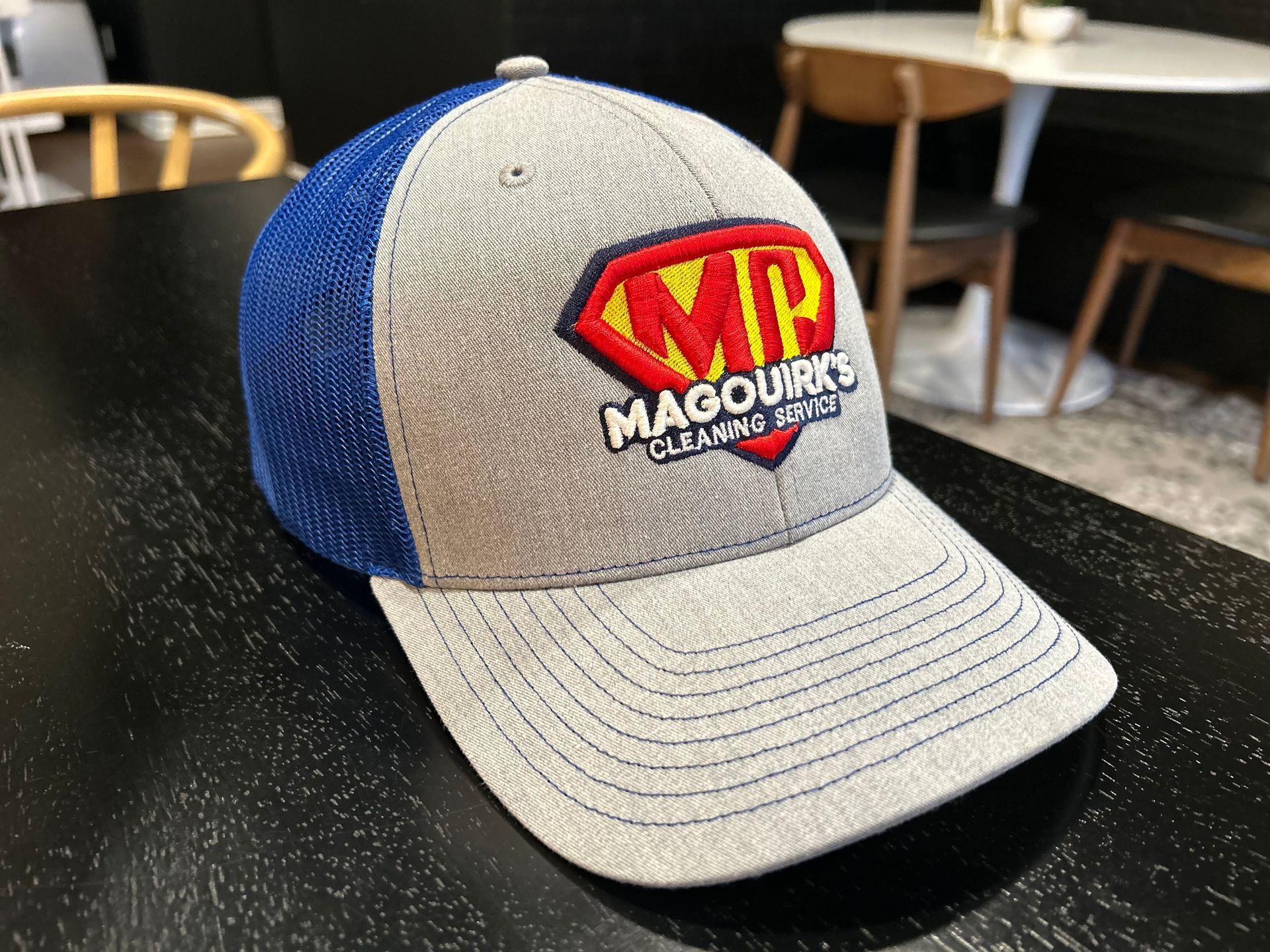
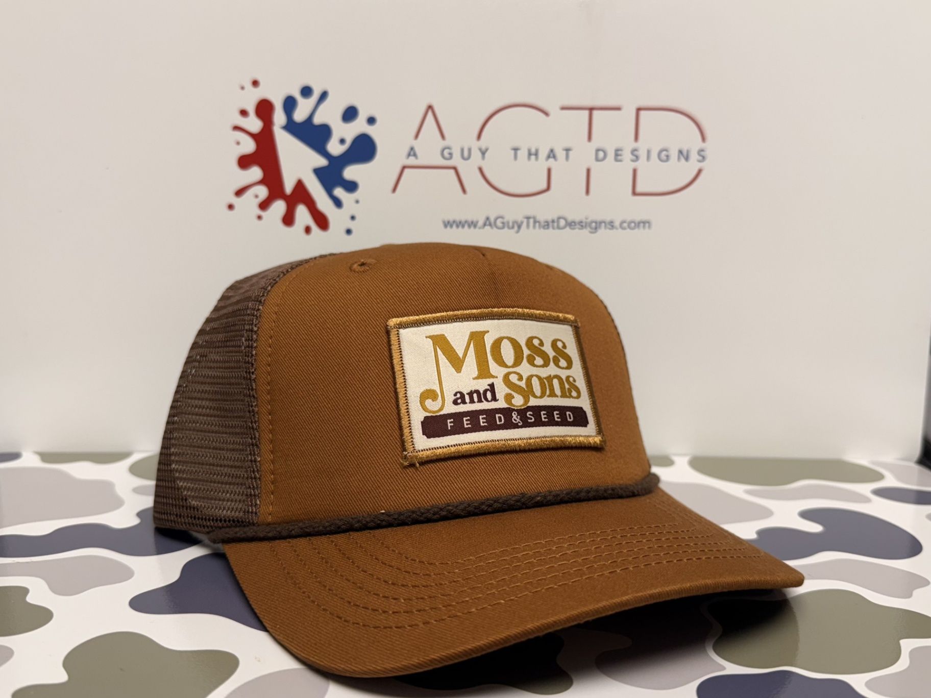
This is especially critical if you're planning to use your logo across physical materials like signs, window graphics, or custom apparel. A logo that loses readability when embroidered on a hat or printed on a shirt isn't doing its job.
3. You Chased Trends Instead of Building Timelessness
The mistake: You saw everyone doing neon gradients or minimalist line art, so you jumped on the bandwagon. Two years later, your logo looks dated and you're already thinking about a rebrand.
Trends are expensive. They force you to constantly refresh your identity instead of building brand equity over time.
How to fix it: Focus on timeless design principles over what's hot right now. That doesn't mean your logo has to be boring: it means it should reflect your brand's core identity, not the flavor of the month.
A well-designed logo should still feel relevant 10 years from now. Think about how that impacts everything from your digital presence to your physical branding materials. Consistency builds recognition. Recognition builds trust.
4. Your Typography is Working Against You
The mistake: You picked a font because it "looked cool" without considering readability, brand alignment, or versatility. Or worse: you're using three different fonts in one logo because you couldn't decide.
Typography communicates just as much as imagery. A law firm using a playful script font sends the wrong message. A kids' brand using a rigid sans-serif feels cold.
How to fix it: Choose one, maybe two fonts max. Make sure they're readable at any size and reflect your brand personality. A tech company might lean modern and geometric. A craft brewery might go bold and hand-drawn.
Test your typography across applications. If it's hard to read on a banner or doesn't translate well to embroidery on custom hats, keep looking.
5. Your Color Choices Are Holding You Back
The mistake: You picked colors because they're your favorites, not because they serve your brand. Or you didn't test contrast, so your logo disappears on certain backgrounds. Or you went wild with a rainbow palette that makes printing a nightmare.
Color isn't decoration: it's psychology. Red communicates energy and urgency. Blue builds trust. Green suggests growth or sustainability. Every choice sends a message.
How to fix it: Be intentional. Choose colors that align with your brand identity and create strong contrast. Test your logo on light backgrounds, dark backgrounds, and everything in between.
And here's a pro tip: make sure your logo works in black and white. If it doesn't, the design itself is weak. You're relying on color as a crutch instead of creating a mark that stands on its own.
This is critical when you're working across mediums: from digital marketing to window graphics to signage to custom apparel. Premium materials like what we use for vehicle wraps demand color accuracy and versatility.
6. You Ignored Your Actual Audience
The mistake: You designed a logo you like instead of one your customers connect with. You didn't research your industry, your competition, or what resonates with your target market.
If you're a wedding photographer with a logo that screams "extreme sports," you've got a problem. If you're a financial advisor with a logo that looks like a kid's birthday party, same issue.
How to fix it: Do your homework. Who are you trying to reach? What do they value? What visual language speaks to them?
Look at your competitors: not to copy them, but to understand the landscape. Then figure out how to stand out while still feeling native to your industry. That balance is what makes a brand impossible to ignore without feeling out of place.
7. Your Logo Only Works in One Format
The mistake: You have one version of your logo, and it doesn't adapt. It only works in color. It only works horizontal. It fails on busy backgrounds or in monochrome applications.
This kills your brand flexibility. You end up with a logo that looks great on your website but terrible everywhere else: or you start creating inconsistent variations that dilute your identity.
How to fix it: Build a complete brand system, not just a single logo file. You need:
- A primary full-color version
- A monochrome (black and white) version
- Horizontal and stacked layouts for different spaces
- A simplified icon version for small applications
- Clear rules for backgrounds, spacing, and usage
This isn't overkill: it's smart branding. When your logo needs to work across your website, social media, email signatures, business cards, storefront signs, banners, and custom merchandise, you need that flexibility built in from the start.
The Bottom Line: Your Logo Is an Investment, Not an Expense
Most businesses treat logo design like a transaction. They want something cheap and fast so they can check the box and move on.
But here's what that approach costs you: visibility, credibility, and revenue.
A professional logo design isn't just about making something pretty. It's about creating a visual identity that works everywhere your brand shows up: from digital marketing and SEO-optimized websites to physical applications like signage, window graphics, and branded apparel.
At A Guy That Designs, we build brands that are impossible to ignore. That means logos designed with both digital and physical applications in mind: because we know your brand doesn't just live online. It lives on storefronts, trucks, hats, shirts, banners, and everywhere else you show up in the world.
If your current logo is making any of these seven mistakes, it's time for a change. Your brand deserves better than "good enough."
Want to create a logo that actually works? Let's talk.
Share This Information